Creating and supporting an accessible platform extends beyond technology. Not only is it important to provide assistive technologies (AT) support through screen readers and keyboard access, but an interactive website also must utilize accessible language in its text and labels...more.
When creating a Vantage course, users are required to select a book title. This feature is used frequently by sighted users, but for those using their keyboards and/or assistive technologies (AT) such as screen readers to navigate the site, the drop-down search list was not apparent or accessible. In other words, AT users could not know which search result option they had selected without using a mouse...more.
When we launched Sage Vantage in 2019, all data activities featured interactive data sets from Sage Stats (a product used by university libraries). The activities were rich with clickable data and students could see the data in different formats, toggling between maps, charts, and tables. But that interactivity came at a cost...more.
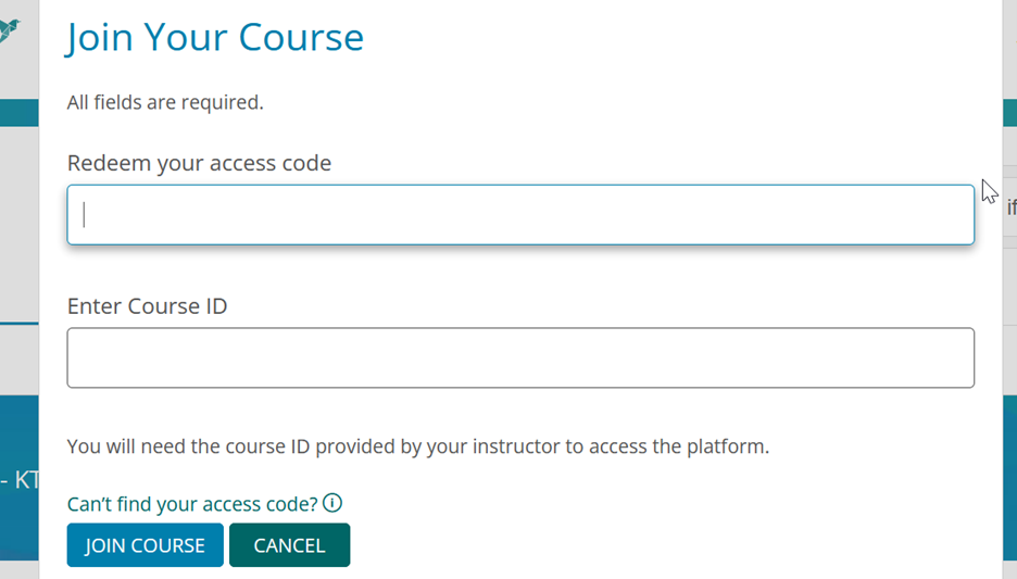
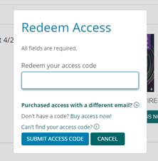
When the Vantage digital platform commercially launched in 2019, students were taken to a separate webpage to redeem their access codes, which caused confusion and introduced navigation issues for assistive technology (AT) users. Students faced two problems...more.
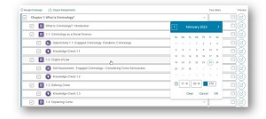
Instructors navigating Vantage exclusively with their keyboards would only be able to close the pop-ups with a mouse click, therefore getting stuck with the calendar pop-up on their screens. Additionally, once the calendar pop-up was closed, the visible focus—which helps users who are navigating a webpage with a keyboard know which item on the webpage has keyboard focus—would return to the web address bar, not the date field...more.
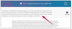
The visible focus—which helps users who are navigating a webpage with a keyboard know which items on a webpage have keyboard focus—was skipping the reading activity instructions in Vantage, making it confusing for students who utilize assistive technology (AT). Users would be placed directly into the reading portion of the activity without having any of the context provided in the headnote, or the ability to navigate to that section using a keyboard.
It is our priority to continuously enhance Vantage’s readability, both from an accessibility perspective and from a general user experience. One opportunity to improve readability was around font size.
Choosing a default font size to display for a platform can be tricky—a perfect font size for one user may be too small for another user. In addition, while web browsers have options for font size and zoom settings, those can change the display of the entire page, and, once enabled, can impact other areas of the page beyond reading (book) text.
Although the world of higher education is more connected online than ever before, there are situations, for a variety of reasons, where students’ access to the internet is a challenge or impossible.
Imagine needing to complete all your reading assignments in an online course without having access to reliable internet in your home. Sadly, this is a reality for too many students, and it can present a real challenge for those whose instructors have assigned course content that can only be accessed online.