You are in: North America
Change location
You are here
Tips for Presenting Data Effectively
Best-selling author Stephanie D. H. Evergreen shares tips from her latest webinar to make your data presentations successful.
- Less is more: Simultaneous listening and reading overloads human working memory, resulting in poor content comprehension, so use a “less is more” approach. Use text for critical information only. Use key graphic elements to support readers’ attention and add selective emphasis.
- The emotional side: Use meaningful, relevant visual elements that engage your audience’s emotions. Your audience is more likely to remember and retain content that engaged them at an emotional level because they will remember how they felt when presented with the information.
- The right direction: Use the directionality implied in many graphics. Place text and images so that the reader’s eyes follow the direction of the graphic toward the text. It is beautifully subtle, but hugely impactful.
- A pop of color: Minimize cognitive overload. Emphasize key content and organize information with strategic use of color. Selective use of color allows you to “chunk” information, easing some of the thinking readers normally have to do and thus increasing their mental capacity and depth of thinking. RGB colors are best for on-screen presentations, while CMYK colors are best for print. Dark gray or black should always be applied to text intended for long, narrative reading.
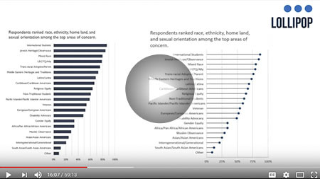
- Pies, bars, and lollipops: Choose the right chart to let your data tell the best story. Humans are good at judging length and bad at judging angles, which means that bar and line charts are more effective options than angular pie charts. Lollipop charts are great when you need to focus on a specific point of interest.
- Do tell: Keep it easy to interpret your graphs with clear data labels and descriptive subtitles. The easier your data and graph’s key points are to digest with properly labeled descriptions, the clearer your data story becomes.
- Hand it to them: Use a handout to give your audience just what they need. When you summarize your notes or place content too dense for a slide into a handout, be sure to give it to your audience on their way out the door so that they don’t read it while you are talking. Another option is a semi-blank handout with only critical information and plenty of blank space for note-taking. This is a good option when you have multiple audiences in the room and it allows each person to choose how much they want to write.
About Stephanie D. H. Evergreen

Dr. Stephanie D. H. Evergreen is an internationally recognized speaker, designer, and researcher. She is best known for bringing a research-based approach to helping researchers better communicate their work through more effective graphs, slides, and reports. She holds a PhD from Western Michigan University in interdisciplinary evaluation, which included a dissertation on the extent of graphic design use in written research reporting. Dr. Evergreen has trained researchers worldwide through keynote presentations and workshops, for clients including Time, Verizon, Head Start, American Institutes for Research, Rockefeller Foundation, Brookings Institute, and the United Nations. She is the 2015 recipient of the American Evaluation Association’s Guttentag award, given for notable accomplishments early in a career. Dr. Evergreen is co-editor and co-author of two issues of New Directions for Evaluation on data visualization. She writes a popular blog on data presentation at stephanieevergreen.com. Her books Presenting Data Effectively and Effective Data Visualization both hit #1 on Amazon bestseller lists.
Titles by Stephanie D. H. Evergreen
